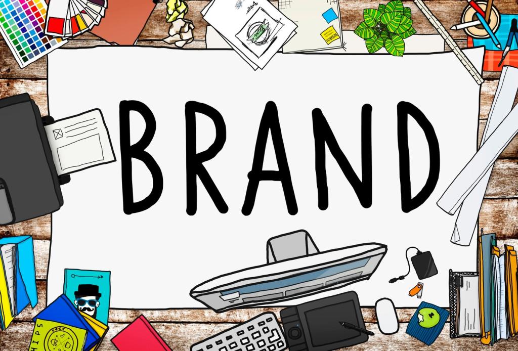
Chosen theme: The Role of Color Psychology in Branding. Explore how hues shape first impressions, signal values, and drive loyalty—then join the conversation, share your brand’s palette story, and subscribe for fresh, color-smart insights.
Why Color Psychology Matters from the Very First Glance
Studies suggest people form product judgments within roughly 90 seconds, with color driving a significant portion of that snap assessment. A well-chosen palette narrows uncertainty, signals category cues, and eases decision-making before a single word is read.
Why Color Psychology Matters from the Very First Glance
Color shortcuts complex messages into feelings: blues calm, reds energize, greens reassure. When used consistently, these emotional cues crystallize into memory structures, helping customers recognize you instantly in busy feeds, crowded shelves, and chaotic marketplaces.
Why Color Psychology Matters from the Very First Glance
A neighborhood café swapped muted beige signage for warm terracotta with teal accents. Foot traffic rose as the storefront finally matched its friendly vibe. Regulars said the space felt ‘sunny’ before reading the menu. What color shift changed your results?
Decoding Color Meanings to Align With Brand Promise
Red accelerates attention and appetite, which is why it thrives in retail, entertainment, and food. Used sparingly, it spotlights calls to action and limited-time offers. Overused, it can feel overwhelming. Balance intensity with ample negative space and steady neutrals.
Decoding Color Meanings to Align With Brand Promise
Blue signals reliability, making it common in finance, healthcare, and tech. Light blues offer openness; deeper navies convey authority. Avoid sterility by pairing with warm neutrals or human-centered photography to keep interfaces friendly while preserving a confident, reassuring tone.
Designing a Cohesive, Flexible Brand Palette
Assign your primary color to recognition moments like logos and CTAs. Use secondaries to structure layouts and data. Accents highlight interactions and seasonal features. Neutrals build breathing room. Codify usage so teams know when to dial volume up or down.
Logos: Timeless Over Trendy
Choose logo colors that survive fleeting fads and work in one-color applications. Test on dark and light backgrounds, small favicons, and large signage. A dependable mark holds its character even when printed in black, etched in metal, or embroidered on fabric.
Packaging: Shelf Impact and Story
On crowded shelves, strategic color blocking improves findability. Use a bold primary for recognition, then a smart secondary system for variants. Include tactile finishes or micro-patterns to reinforce brand sensibility, ensuring sustainability claims align with the palette’s material choices.
Digital Interfaces: States and Signals
Define consistent colors for hover, active, error, and success states. Reserve your most saturated hue for primary CTAs to prevent visual fatigue. Validate readability across devices, dark mode, and bright sunlight so crucial actions remain clear in real-world conditions.
Testing, Learning, and Proving Color’s Business Impact
When testing CTA colors, hold copy, placement, and timing constant. Pre-register success metrics, run sufficient sample sizes, and segment by device. Small lifts matter when reproducible; otherwise, you’re optimizing noise instead of building durable, conversion-driving color systems.
Testing, Learning, and Proving Color’s Business Impact
Use interviews, card sorts, and semantic differentials to gauge perceived traits like ‘trustworthy’ or ‘innovative.’ Ask participants to recall brands by color to test distinctiveness. Layer qualitative insights with analytics to confirm your palette truly signals the values you promise.